Why Your Link in Bio Doesn't Convert
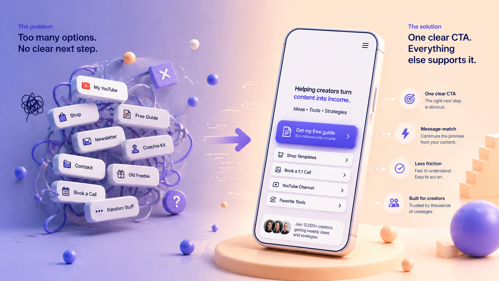
Your link in bio usually doesn’t convert because it acts like a link list instead of a routing page. The fix is simple: lead with one clear CTA, match the page to why people clicked, and remove friction so the next step feels obvious.



Why Your Link in Bio Doesn't Convert
If your link in bio gets clicks but not signups, sales, replies, or bookings, the problem usually is not traffic. The problem is clarity. Most bio pages act like storage for links when they should act like routing pages for action.
A click is not the result. A click is the test. If the next step is unclear, generic, or slow, the visitor leaves.
Why your link in bio gets clicks but not results
Most creators build a bio page by adding everything they might want someone to see. Newsletter. Shop. YouTube. Media kit. Old freebie. Booking link. Storefront. Contact form.
Nothing looks broken. That is exactly why it underperforms.
When every link has the same weight, the visitor has to do the sorting. They have to decide what matters, what is relevant, and what to do next. That small moment of friction kills momentum fast, especially on mobile.
More links can make the page feel complete. They rarely make it convert better.
Your bio page is not a link list
This is the shift that matters.
A bio page is not profile decoration. It is not proof that you have many things going on. It is a conversion surface. Its job is to help the right person take the right next step with the least friction possible.
That changes the question.
Instead of asking, “What should I include?” ask, “What should happen next?”
That one change makes most bio pages better. You stop building for completeness and start building for direction.
Three reasons your link in bio doesn't convert
1. No primary call to action
If every button looks equally important, nothing feels important.
A visitor should not have to guess what you want them to do. If your main goal is newsletter growth, the signup should lead. If your goal is sales, the product should lead. If your goal is brand deals, the inquiry path should lead.
One clear action beats six polite options.
2. Weak message-match
People click from a specific context. A Reel. A Story. A TikTok. A product mention. A free resource.
Then they land on a generic page with a stack of unrelated links.Why Your Link in Bio Doesn't Convert
If your link in bio gets clicks but not signups, sales, replies, or bookings, problem usually is not traffic. Problem is clarity. Most bio pages act like storage for links when they should act like routing pages for action.
A click is not result. A click is test. If next step is unclear, generic, or slow, visitor leaves.
Why your link in bio gets clicks but not results
Most creators build a bio page by adding everything they might want someone to see. Newsletter. Shop. YouTube. Media kit. Old freebie. Booking link. Storefront. Contact form.
Nothing looks broken. That is exactly why it underperforms.
When every link has same weight, visitor has to do sorting. They have to decide what matters, what is relevant, and what to do next. That small moment of friction kills momentum fast, especially on mobile.
More links can make page feel complete. They rarely make it convert better.
Your bio page is not a link list
This is shift that matters.
A bio page is not profile decoration. It is not proof that you have many things going on. It is a conversion surface. Its job is to help right person take right next step with least friction possible.
That changes question.
Instead of asking, "What should I include?" ask, "What should happen next?"
That one change makes most bio pages better. You stop building for completeness and start building for direction.
Three reasons your link in bio doesn't convert
1. No primary call to action
If every button looks equally important, nothing feels important.
A visitor should not have to guess what you want them to do. If your main goal is newsletter growth, signup should lead. If your goal is sales, product should lead. If your goal is brand deals, inquiry path should lead.
One clear action beats six polite options.
2. Weak message-match
People click from a specific context. A Reel. A Story. A TikTok. A product mention. A free resource.
Then they land on a generic page with a stack of unrelated links.
That disconnect matters. If your content promises one thing, your bio page should continue that exact thread. If post is about your free guide, guide should be first. If content is about your offer, offer should be first.
Intent is fragile. Your page should confirm it, not reset it.
3. Too much friction
Most bio traffic is mobile traffic. That means patience is low.
Long stacks of buttons, vague labels like "check this out," extra pages before real offer, and cluttered layouts all create delay. Delay creates doubt. Doubt kills action.
A better bio page feels fast to understand. Visitor knows where to tap and why it matters.
How to fix your link in bio
Start with one primary CTA. Not three. One.
Then add three to five secondary links at most. Enough to support different visitor types, not enough to create a decision maze.
Use specific CTA copy. "Shop presets" works better than "Products." "Get free pitch template" works better than "Freebie." Specific words reduce hesitation because they tell people what happens next.
Add one trust signal near top. A short line that explains what you do, who it is for, or what result people can expect. This does more work than extra design polish.
Examples:
- Helping beauty creators turn tutorials into product sales
- Free weekly ideas for creators who want better brand deals
- Templates for turning followers into coaching leads
Last, cut unnecessary taps. If you want visitor to join, buy, apply, or reply, make that path direct. A link in bio should shorten journey, not add steps to it.
Less choice usually means more conversion
Creators often fear removing links because it feels like losing opportunities. In practice, opposite is usually true.
A focused bio page does not reduce value. It reduces hesitation.
Strongest bio pages still offer options. They just do not make every option compete at same level. They guide attention before they offer variety.
That is why some pages get tapped and forgotten, while others quietly turn traffic into real outcomes.
Your link in bio does not need more links. It needs a clearer next step.
That disconnect matters. If your content promises one thing, your bio page should continue that exact thread. If the post is about your free guide, the guide should be first. If the content is about your offer, the offer should be first.
Intent is fragile. Your page should confirm it, not reset it.
3. Too much friction
Most bio traffic is mobile traffic. That means patience is low.
Long stacks of buttons, vague labels like “check this out,” extra pages before the real offer, and cluttered layouts all create delay. Delay creates doubt. Doubt kills action.
A better bio page feels fast to understand. The visitor knows where to tap and why it matters.
How to fix your link in bio
Start with one primary CTA. Not three. One.
Then add three to five secondary links at most. Enough to support different visitor types, not enough to create a decision maze.
Use specific CTA copy. “Shop presets” works better than “Products.” “Get free pitch template” works better than “Freebie.” Specific words reduce hesitation because they tell people what happens next.
Add one trust signal near the top. A short line that explains what you do, who it is for, or what result people can expect. This does more work than extra design polish.
Examples:
- Helping beauty creators turn tutorials into product sales
- Free weekly ideas for creators who want better brand deals
- Templates for turning followers into coaching leads
Last, cut unnecessary taps. If you want the visitor to join, buy, apply, or reply, make that path direct. A link in bio should shorten the journey, not add steps to it.
Less choice usually means more conversion
Creators often fear removing links because it feels like losing opportunities. In practice, the opposite is usually true.
A focused bio page does not reduce value. It reduces hesitation.
The strongest bio pages still offer options. They just do not make every option compete at the same level. They guide attention before they offer variety.
That is why some pages get tapped and forgotten, while others quietly turn traffic into real outcomes.Your link in bio does not need more links. It needs a clearer next step.
Tagged with
Continue reading
The Best Linktree Alternative Depends on Your Goal
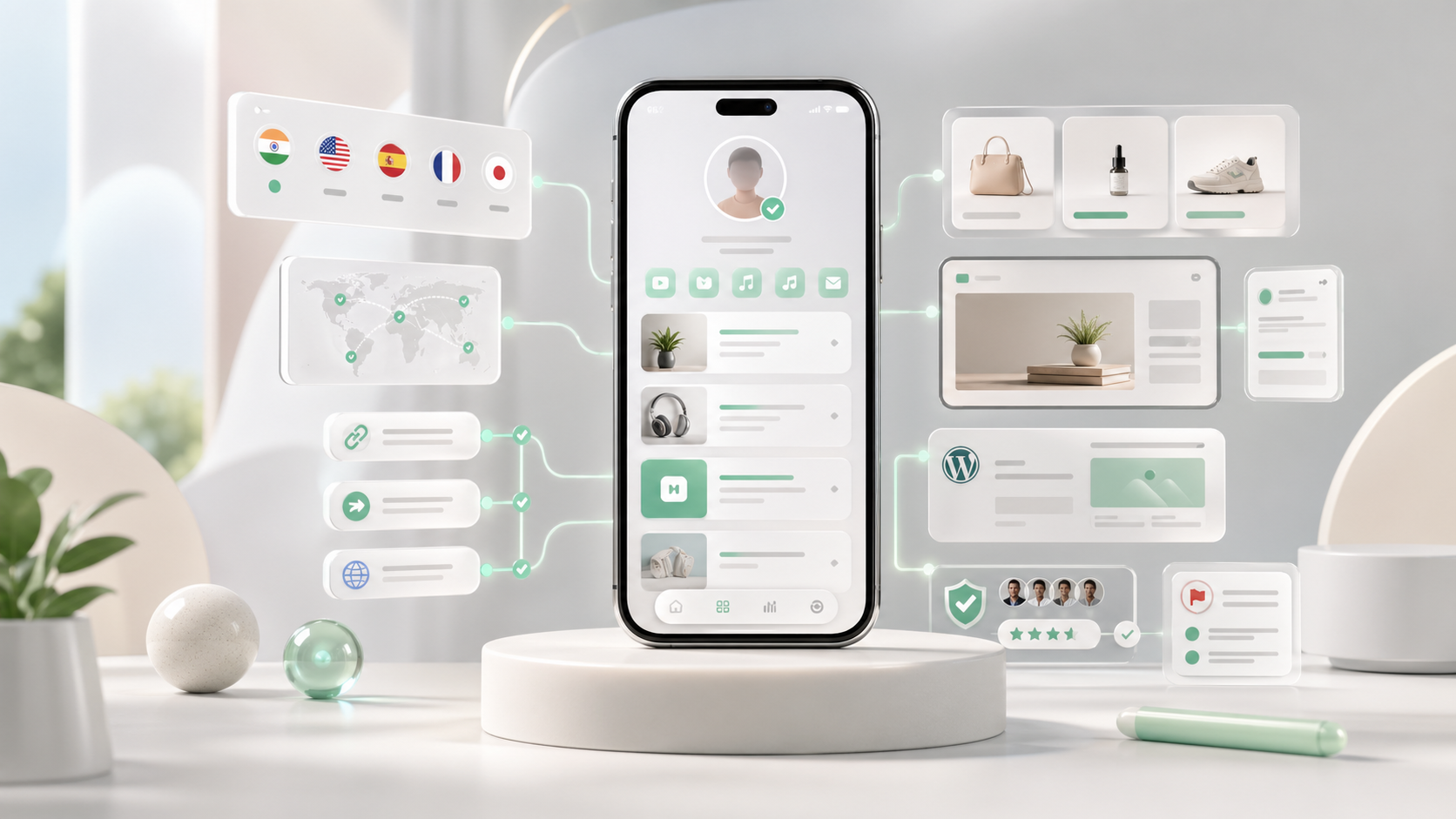
A practical comparison of Linktree alternatives by pricing, use case, and creator goal, with Shuuka positioned for multilingual identity, trust, routing, embeds, apps, and customization.
How Creators Can Ride a Bollywood Trend Without Looking Desperate
A practical guide for influencers on using Bollywood trends for useful content without making generic reaction posts.
How Fashion Creators Can Turn Spring Trends Into Bio Clicks
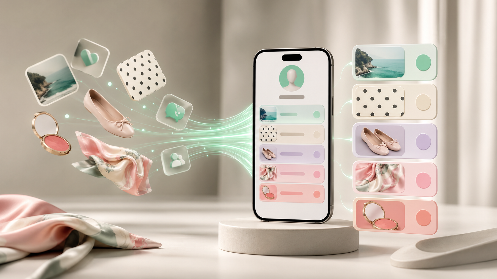
Spring fashion and beauty searches are rising around nostalgic, specific items. Here is how influencers can turn trend attention into clearer bio clicks.